Graphic Design
Welcome to the graphic design department!
Here's a few samples of work I have been proud to be a part of...
Communication to an audience is vital. Let's face it, if something isn't easy to use, navigate, or understand, why bother going any further? Graphic design means communicating an idea or message using words, images and graphics to inspire, inform and captivate consumers in an efficient but visually charming way. Graphic design solves problems. It is an experience for a user, so make it unforgettable.
With every new project there is a lot of research and investigation. You need to stand out against your competition by offering your target audience, specific niche and targeted demographics something new, interesting and unique. What is your aim - more sales? More subscriptions? More awareness of your company?
Graphic design is about connecting people, making a striking visual communication, and something that makes you say 'wow'!


Product and Packaging Design
GRAPHIC DESIGN • 3D RENDER • MOCK UP • PRODUCT DESIGN • PACKAGING DESIGN • PERSONAL PROJECT
MooksGoo Body Lotion!
If you haven't guessed yet, I love yellow, black and white! This mock up was created whilst learning new software - Adobe Dimension.
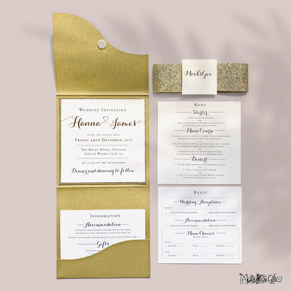

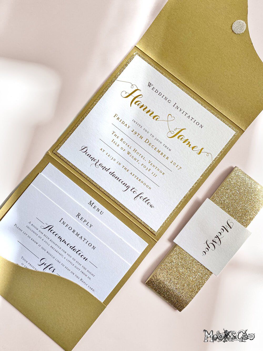
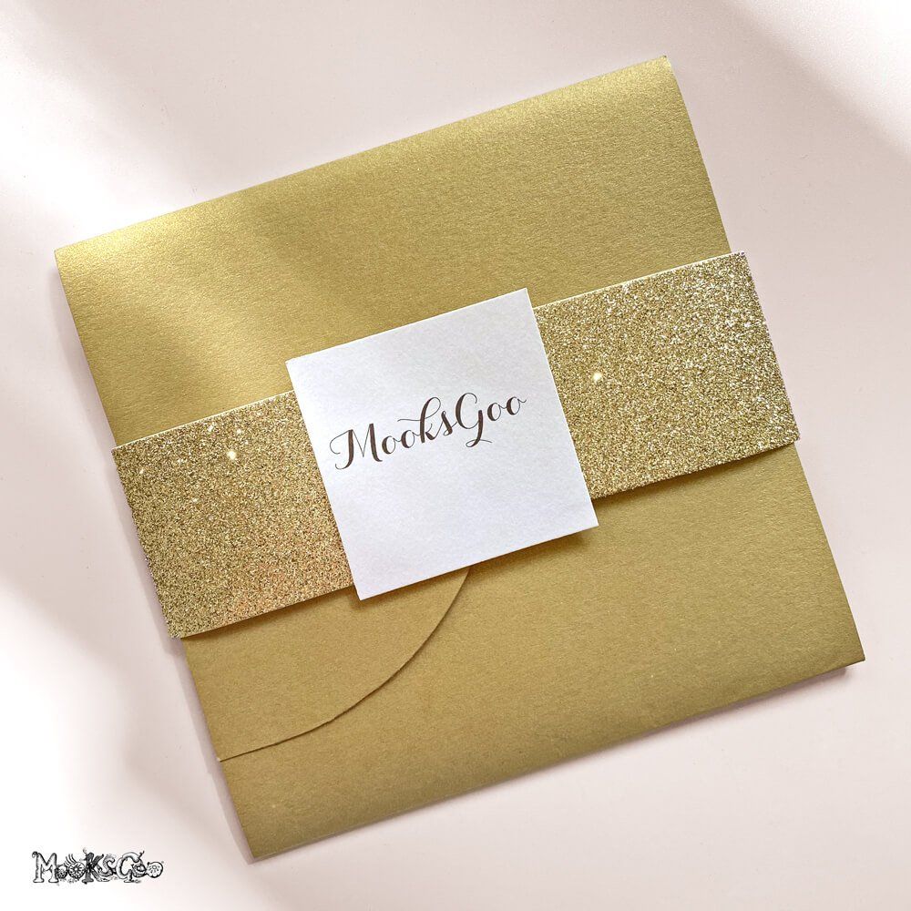
Wedding Invitation
GRAPHIC DESIGN • NESTED INVITATION, MENU AND RSVP CARD • FOLDED ENVELOPE • PRINTING GOLD FOIL • TEXTURED PEARL STOCK • GOLD GLITTER
Bespoke Design and Fold
This luxurious wedding invitation was an exciting experience for the guest, as the envelope housed the venue information, the menu and the RSVP card. The gold embossed foil and gold glitter background added depth and tactility. One would say it is rather lavish, darling.
"These are the most beautiful wedding invitations we've ever seen. Our guests were absolutely blown away with them!"
Mr and Mrs London
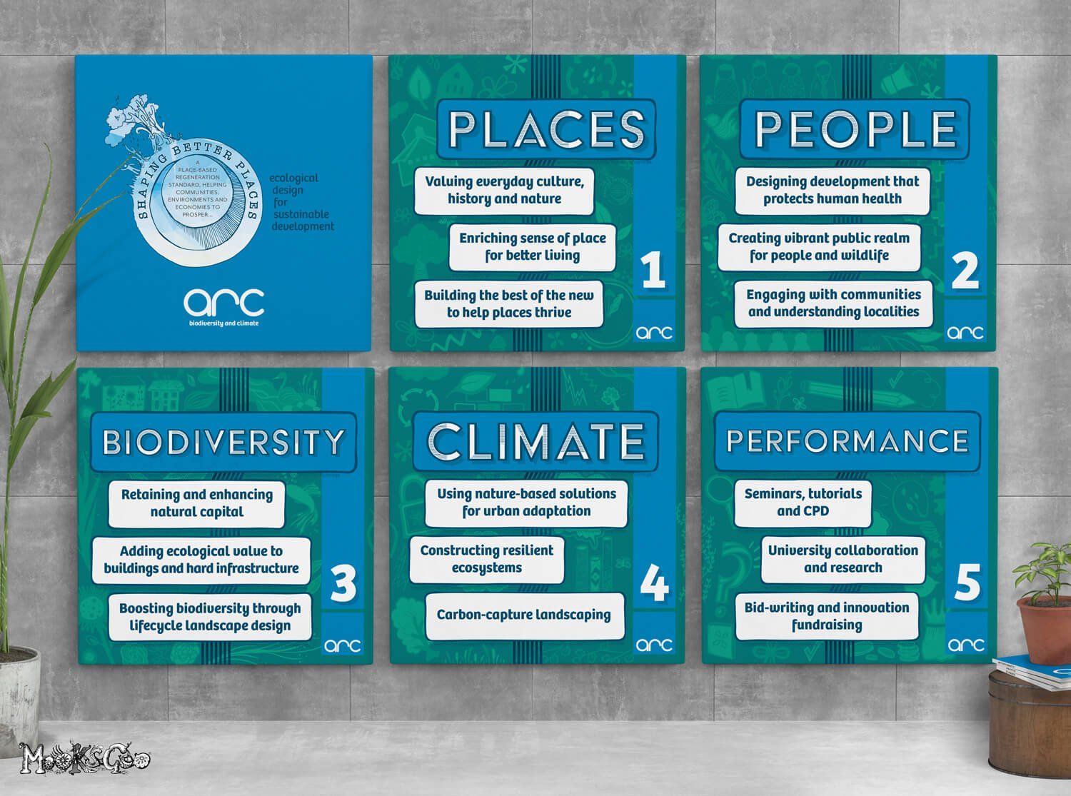


Exhibition Panels
CLIENT: Arc Biodiversity
GRAPHIC DESIGN • LOGO DESIGN • ILLUSTRATION • EXHIBITION DISPLAY PANELS • PRINTING
Large Exhibition Panels
A series of 6, 1 metre panels that were displayed at the Futurebuild exhibition, London, for the company Arc. This was a collaboration for the good of the world, something which I am extremely passionate about! Each panel represents a different topic, which Arc specialises in.
There are hand drawn illustrations for each theme - places, people, biodiversity, climate and performance. Arc really are an amazing team; it's a pleasure to work with them on many of their exciting projects!
Logo Design
Shaping Better Places is a 'place-based regeneration standard, helping communities, environments and economies to prosper'. It is a manifesto that needed maximum visual appeal, and Arc were determined to get this out there! The logo compliments the blues in the branding, and there are a lot of illustrated elements throughout their campaigns.
"You've brought our visions together Michelle - just so clever! Thanks so much for all your excellent hard work!"
Claire Hector, Arc

Logo Design
CLIENT: Isle of Wight Hockey Club
GRAPHIC DESIGN • SPORTS LOGO DESIGN • HOCKEY SHIRT MOCKUP
The colour combination of bright orange and a deep inky blue exerts power and enthusiasm - very encouraging for a sports team. In the centre of the logo, the Isle of Wight shape has a hockey stick (instead of the normal River Medina), with a sequence of 'hockey balls'. These balls are increasing in size, depicting the growth and success of the team.
The circles encompassing the logo suggests a team, working wholly as one unit. The bold serif font is strong and aligned - similar to their team spirit!
"We’re very happy with the end result and I particularly like the way the River Medina has been shaped like a hockey stick - very clever. We want to thank MooksGoo for her hard work!"
Isle of Wight Hockey Team
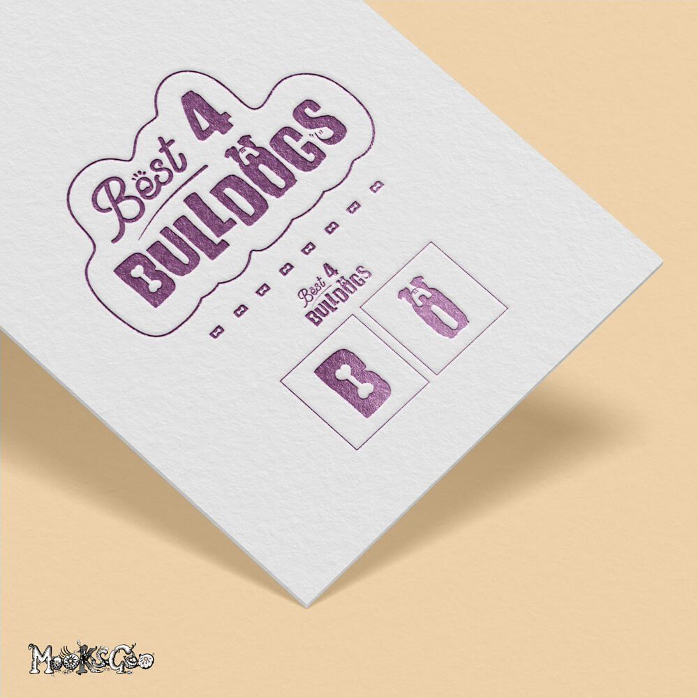
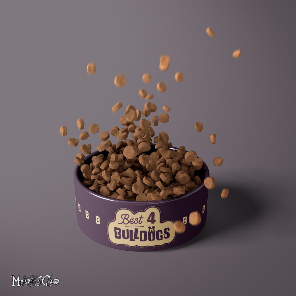
Logo Design
CLIENT: Best4Bulldogs
GRAPHIC DESIGN • LOGO DESIGN • BUSINESS CARD LAYOUT • DOG BOWL DESIGN
Shape - the shape reflects the pendant on a dog collar, all encompassed within a solid block, but with a fun, asymmetrical edge.
Colours - Similar to the purple already existing in their website to keep a little familiarity with their existing audience, the rich maroon/browny-purple suggests luxury, and is often linked to something you are passionate about - your pooch! It also represents strength, excitement and power - perfect for a bulldog (or similar breeds). The fawn colour represents a cosy and warm feeling - something that a man’s best buddy provides you with. Also, a lot of dogs are this colour too. The client wanted gold, or something similar, so this colour is a toned down version of your typical gold. Anything more vibrant felt too garish and didn’t work well within the composition.
Type - The ‘e’ in 'Best' has a subtle paw print. The ‘e’ and the ‘s’ together make a dog’s face (the middle bit of the e and the top part of the s are the eyes - you may have to squint - it’s subtle!). The ‘B’ in 'Bulldog' has a bone, the ‘O’ suggests a bulldog sitting - the bulldog’s nose is also the B (with the bone!), and the ‘S’ has a waggy tail. The way ‘Bulldog’ is misaligned suggests bounding fun and movement - a dog isn’t still for long! The line under ‘best’ leads your eye to the ‘bulldog’.
This logo(s) can be converted into a stamp for packaging, embroidery, stickers, or even dog tags for the future.
"The work was done to the highest standard and in a timely fashion. Communication was great throughout and the final design was everything I hoped for and more!"
Best4Bulldogs

Branding
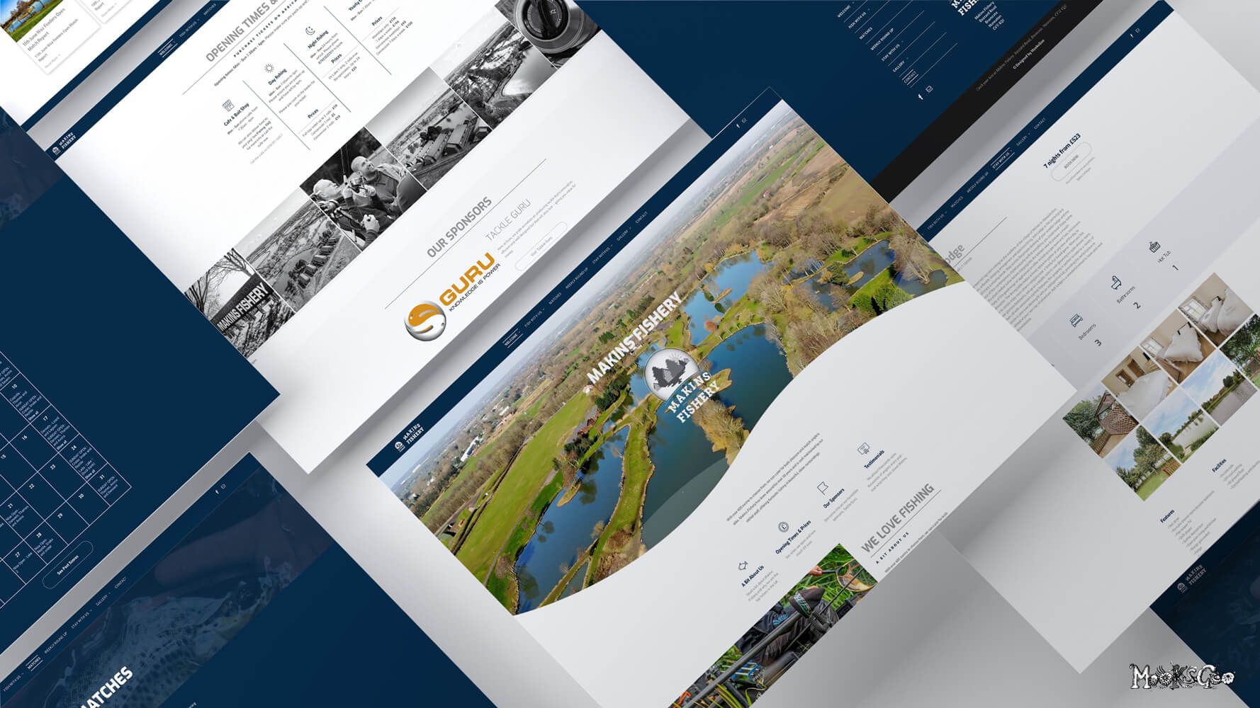
CLIENT: Makins Fishery
GRAPHIC DESIGN • LOGO DESIGN • RESPONSIVE WEBSITE • INTEGRATED BOOKING SYSTEM • BLOG • EMAILS • MAP DESIGNS
Logo Design and Branding
Makins Fishery is a prolific fishing complex in Warwickshire, boasting miles of natural lakes and scenic views, inviting millions of visitors through its doors every year. This project was a rebrand, as the company had been established for many years but wanted something modern and fresh.
Their brief requested the logo to be timeless and mainly reflect the nature that surrounds their lakes. As well as fishing, they offer luxury lodges for relaxing getaways (or a fun fishing weekend!), alongside a large touring and camping area - encompassed by open spaces and natural beauty. There is a little 'nod' to fishing in the logo - the lodges have subtle hooks hanging from the rooves.
Website and Maps
The website was quite a big build, with a bespoke booking system for their lodges, camping and touring. The opening page has a fantastic video of the complex, which was captured by a drone (on a sunny day - making it even more beautiful!), showing their audience the focal point straight away. Incorporated in the website is a monthly calendar with upcoming fishing competitions and daily schedules, with a 'weekly round up' blog, displaying information on match reports and past competitions. The team at Makins has their own Content Management System, so they can amend and update the site themselves. The website now gets thousands of visits daily and the feedback on the new site has been phenomenal.
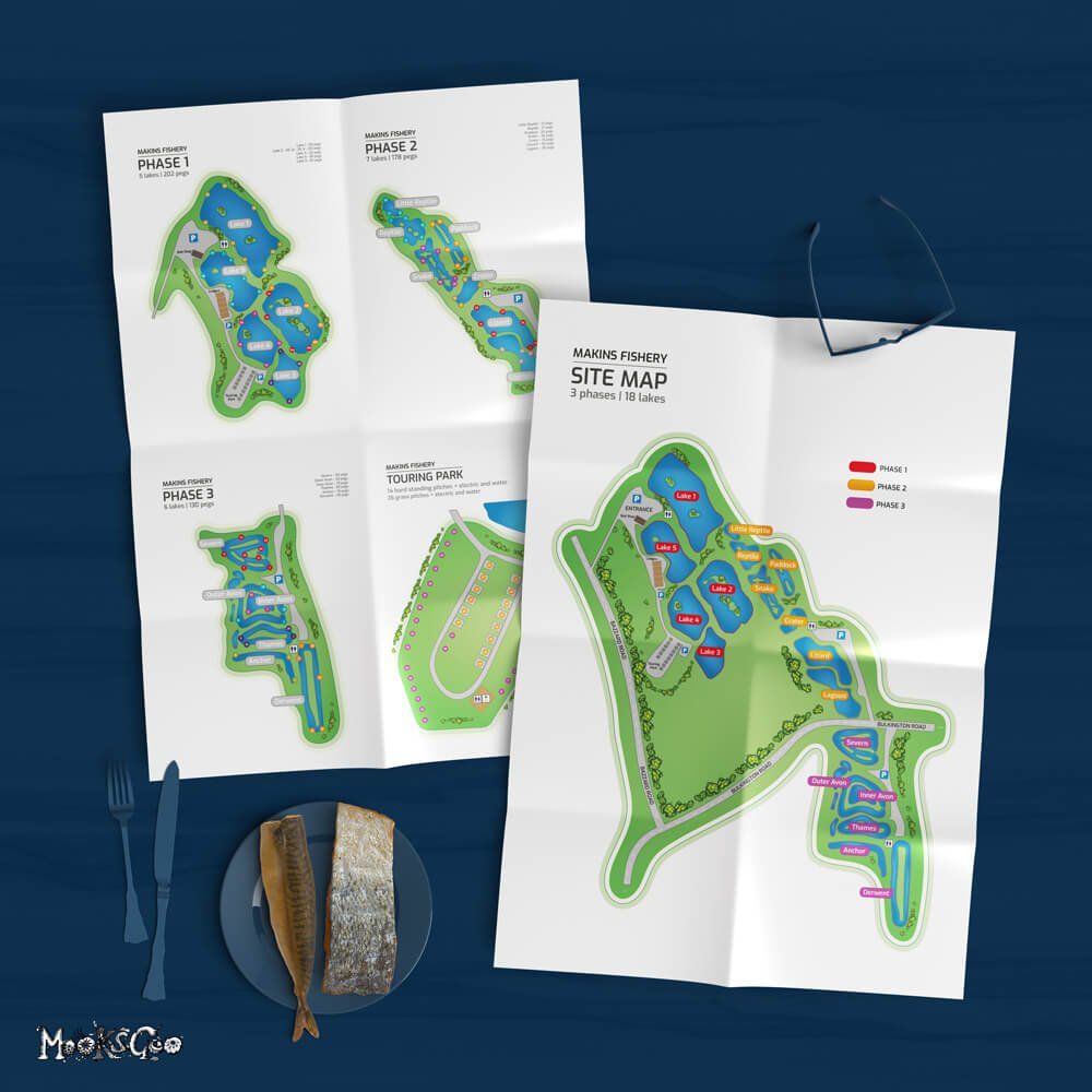
The overall fishing complex is enormous so I created very clear, easy to read, colour coded maps for their visitors, both on the website and for signage purposes.
"The feedback on our new website has been fantastic. It's so easy to use and our online bookings have massively grown."
Makins Fishery
Logo Design
CLIENT: Ready Steady Flow
GRAPHIC DESIGN • BUSINESS NAME • LOGO DESIGN • BRANDING • UNIFORM
Ready Stead Flow - a play on words for Ready Steady Go - is a 'punny' name for this plumbing company. To have a name that can be remembered, especially for a saturated line of business, was key when creating the name. No one appreciates a blocked pipe - it needs to flow (sorry not sorry).
Plumbing is full of pipes and water, so the logo had to be, too. Working with 3d software, this logo has been brought to life with texture and depth - one of my favourite logos to date!
"What a logo! We get compliments wherever we go, and people remember it better than our competitors. Thanks Michelle, it's absolutely fantastic."
Ready Steady Flow
Logo Design
CLIENT: Endless Possibilities
GRAPHIC DESIGN • LOGO DESIGN
Endless Possibilities is an inspirational online blog, created by someone who has overcome addiction.
The green bewildered scribble represents a mind that is overwhelmed by thoughts of confusion, fog and the unknown, but there is clarity behind it. There is a sad face on the first 'S' - the beginning of the journey, and a happy face in the last 'S' - there is hope and happiness after addiction. The green represents healing, growth and renewal.
"Thank you so so much. I love what you have created and the thought that's gone into it. Can't thank you enough actually!"
Endless Possibilities
Logo Design
CLIENT: Meraki
GRAPHIC DESIGN • LOGO DESIGN • RETAIL TAGS
Simple and slick, this logo design is for a brand that creates beautiful handmade leather goods.
"My logo is modern and luxurious, just what I wanted! Thank you so much!"
Meraki


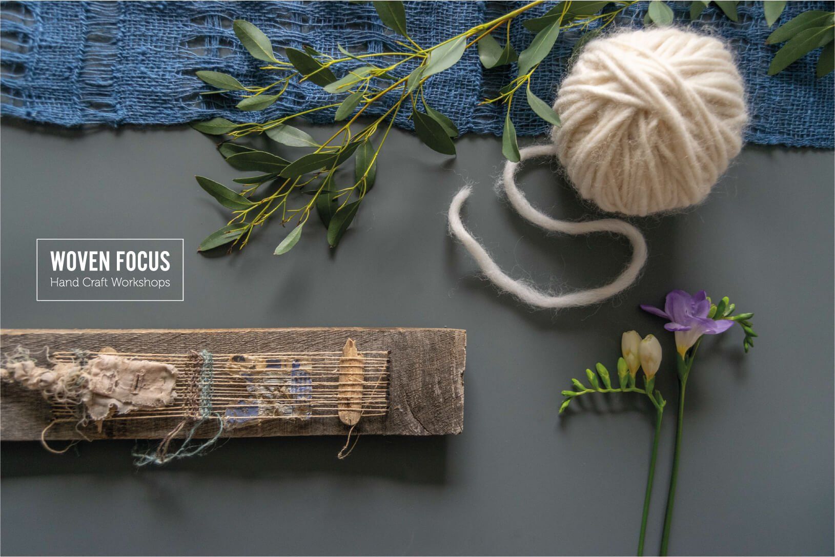


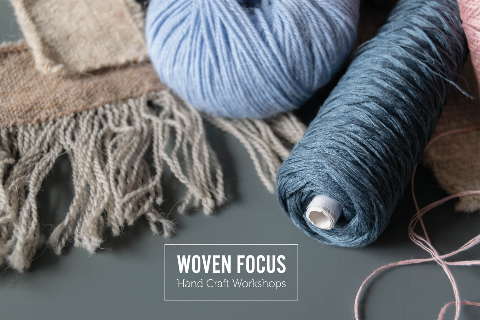
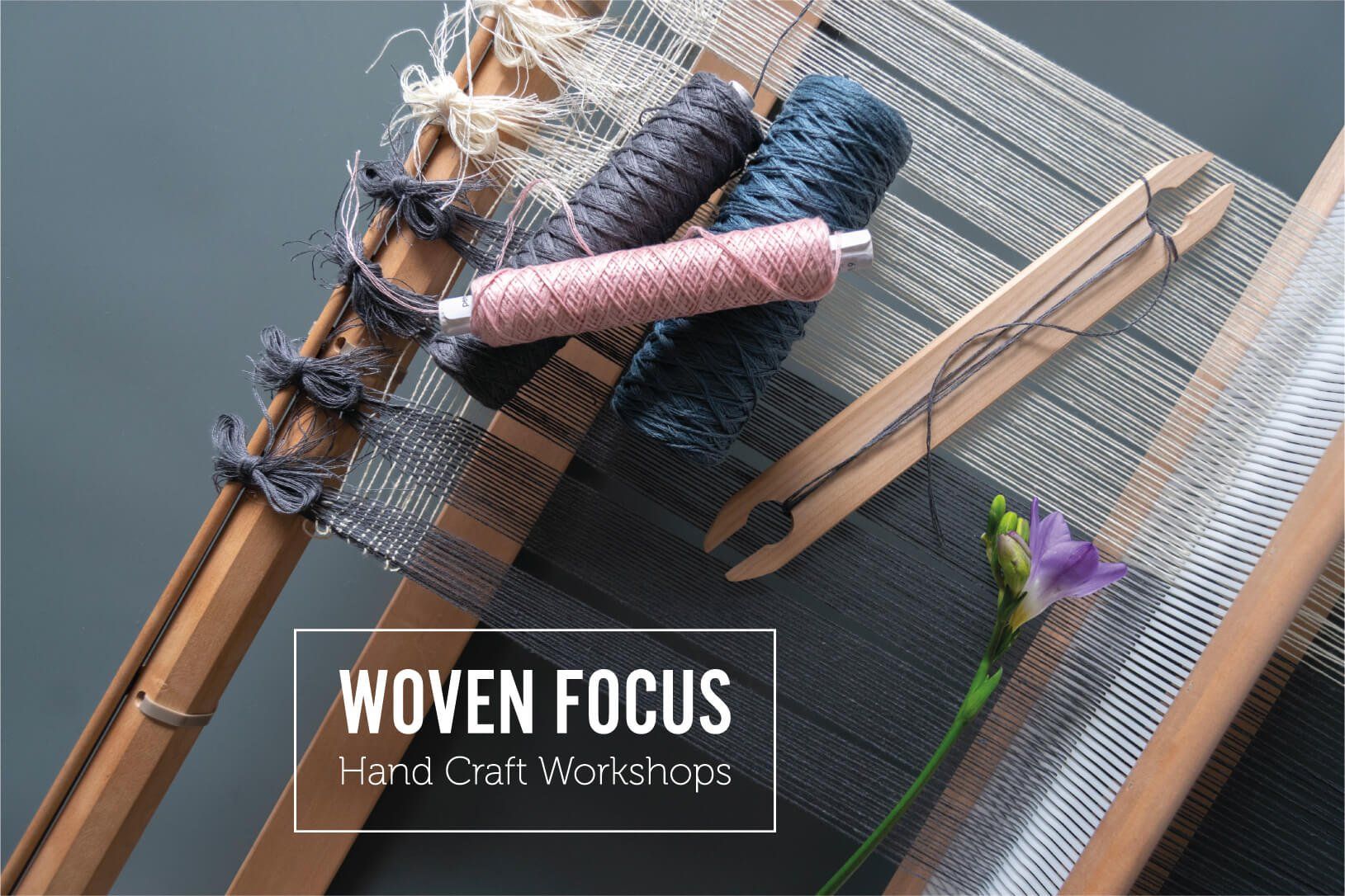
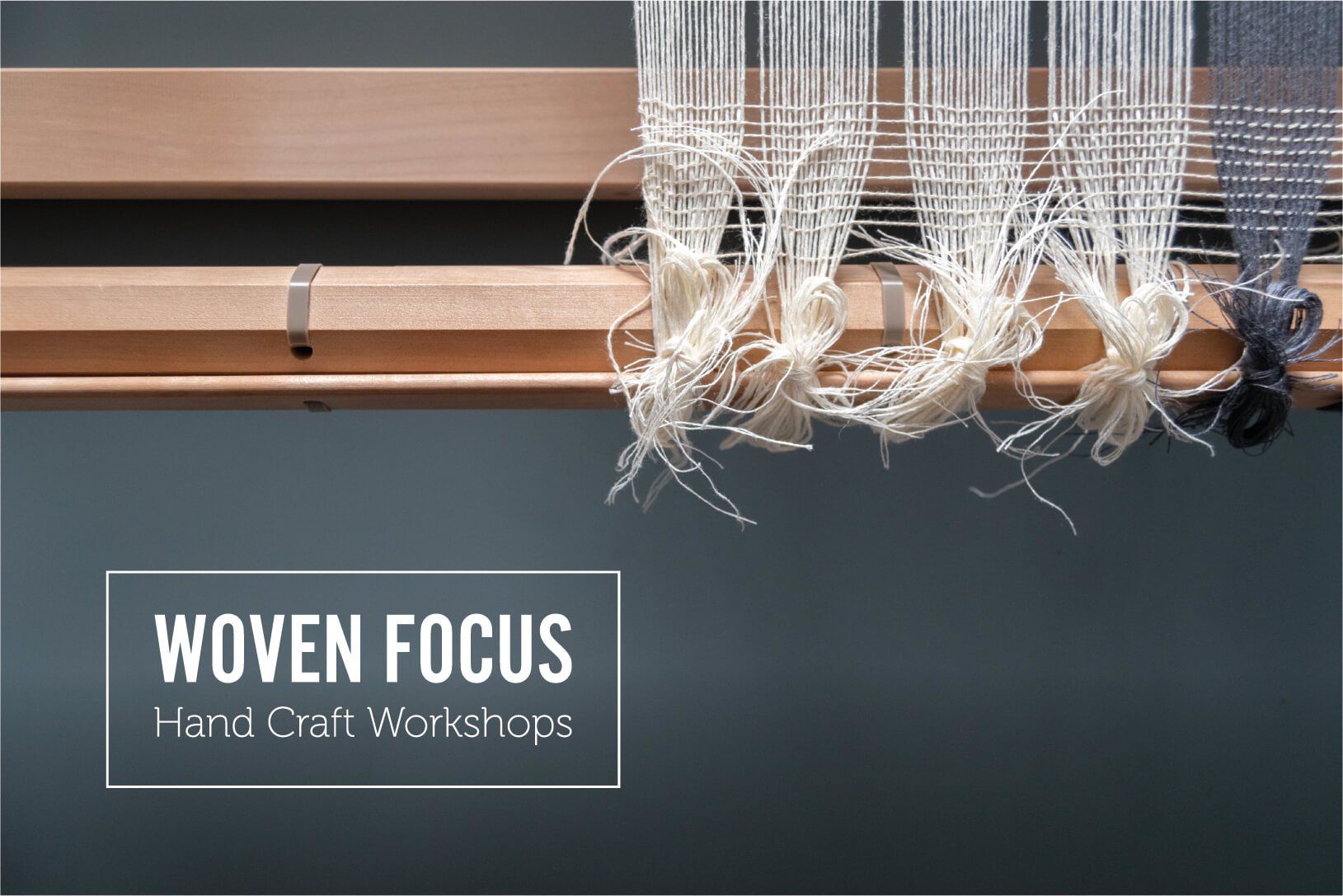


Photography
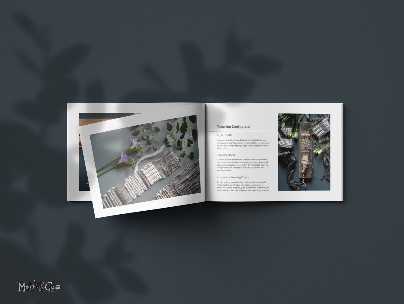
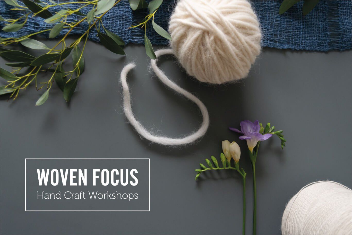
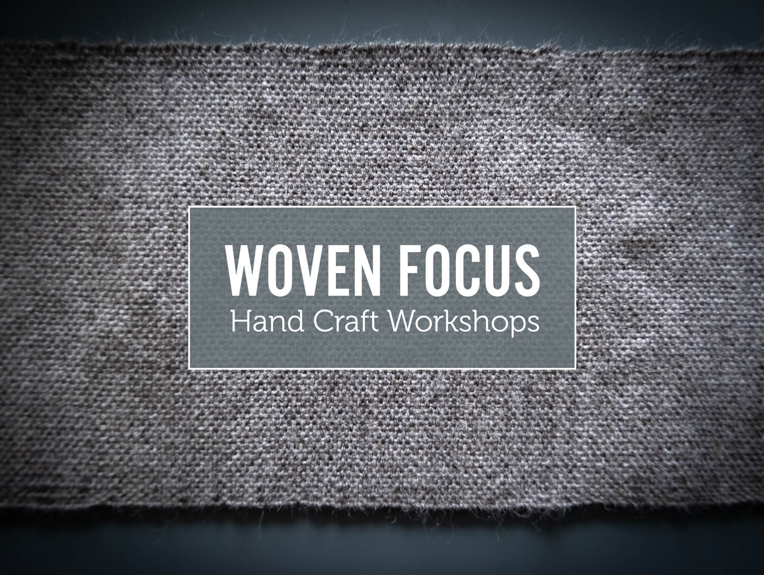
CLIENT: Woven Focus
LOGO DESIGN • BRAND STYLING • PHOTOGRAPHY • SCENE STYLING • LOOK BOOK BROCHURE • PRINTING
Jo's specialty is hand weaving, and her work is incredible! Woven Focus offers handcraft workshops, and has a creative studio based on the Isle of Wight. It's a super place to visit and learn a new hand craft skill, with an emphasis on client wellbeing and a powerful ethos of sustainable practice.
She wanted a look book style collection of her beautiful handmade creations. The beauty of these images lies within the skill that was captured by the camera, therefore the logo was to be simplistic, and subtly sit within the series of images.
"Michelle is a creative powerhouse. I am so pleased with the photography and logo for my website, Woven Focus. She really hit the brief ensuring the design process was collaborative, yet steered professionally with her expertise of the industry to refine the creative concept. Michelle is an absolute joy to work with and I can’t recommend her highly enough!"
Jo James Textiles
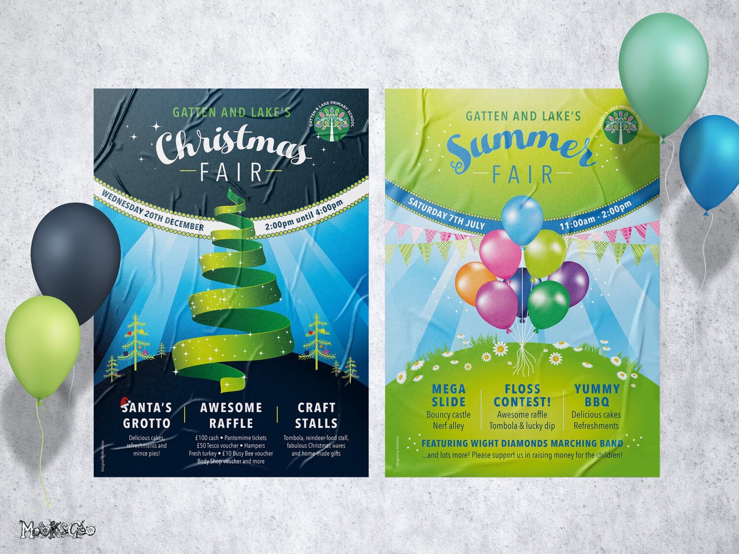
Poster Designs
CLIENT: Primary School
GRAPHIC DESIGN • POSTER DESIGN • PRINTING
A simple example of Christmas and summer fair posters for a primary school. The audience was of course children, so they had to be visually vibrant and fun. The posters also had to be easy to read for the parents, whilst rushing on the school pick-up!
"They're perfect Michelle, thank you so much for the quick turnaround!"
Gatten & Lake Primary School