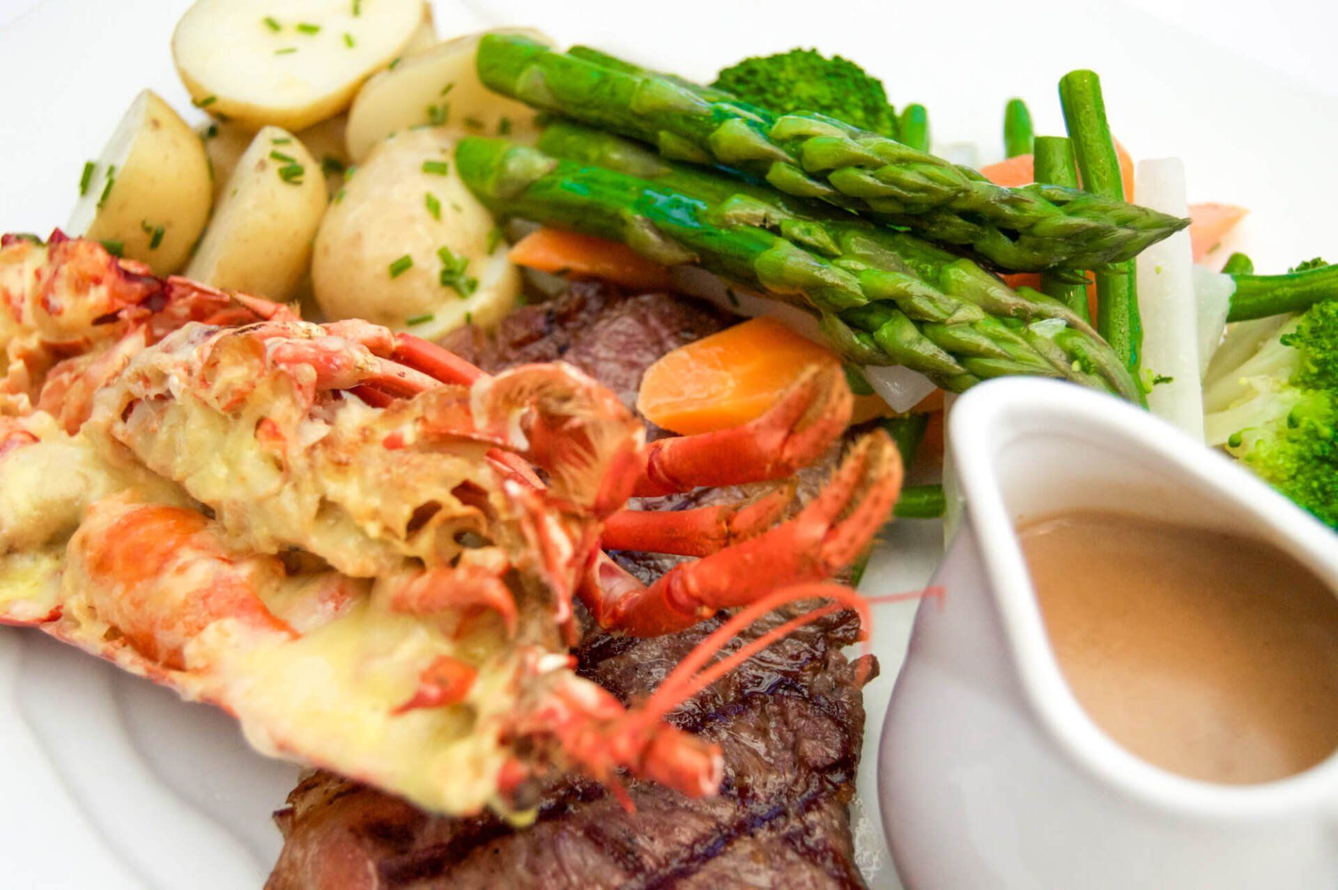
Restaurants and Eateries
Bakers • Restaurants • Pubs and Bars • Cafés
Living on the Isle of Wight means I am surrounded by delicious, culinary joy... and I, for one, am a total foodie! Tourists from all over the world visit the Island for its renowned local produce.
The Island has incredible farmers, bakers and growers, who provide all sorts of eateries and public alike with fresh, homemade and home-grown deliciousness. I have been lucky enough to work with some of these fabulous establishments, and here is a selection for you to nose at.
If you haven't already, pop to the Isle of Wight and see for yourself how awesome the food is. And if you live on the Isle of Wight, lucky us, ay!
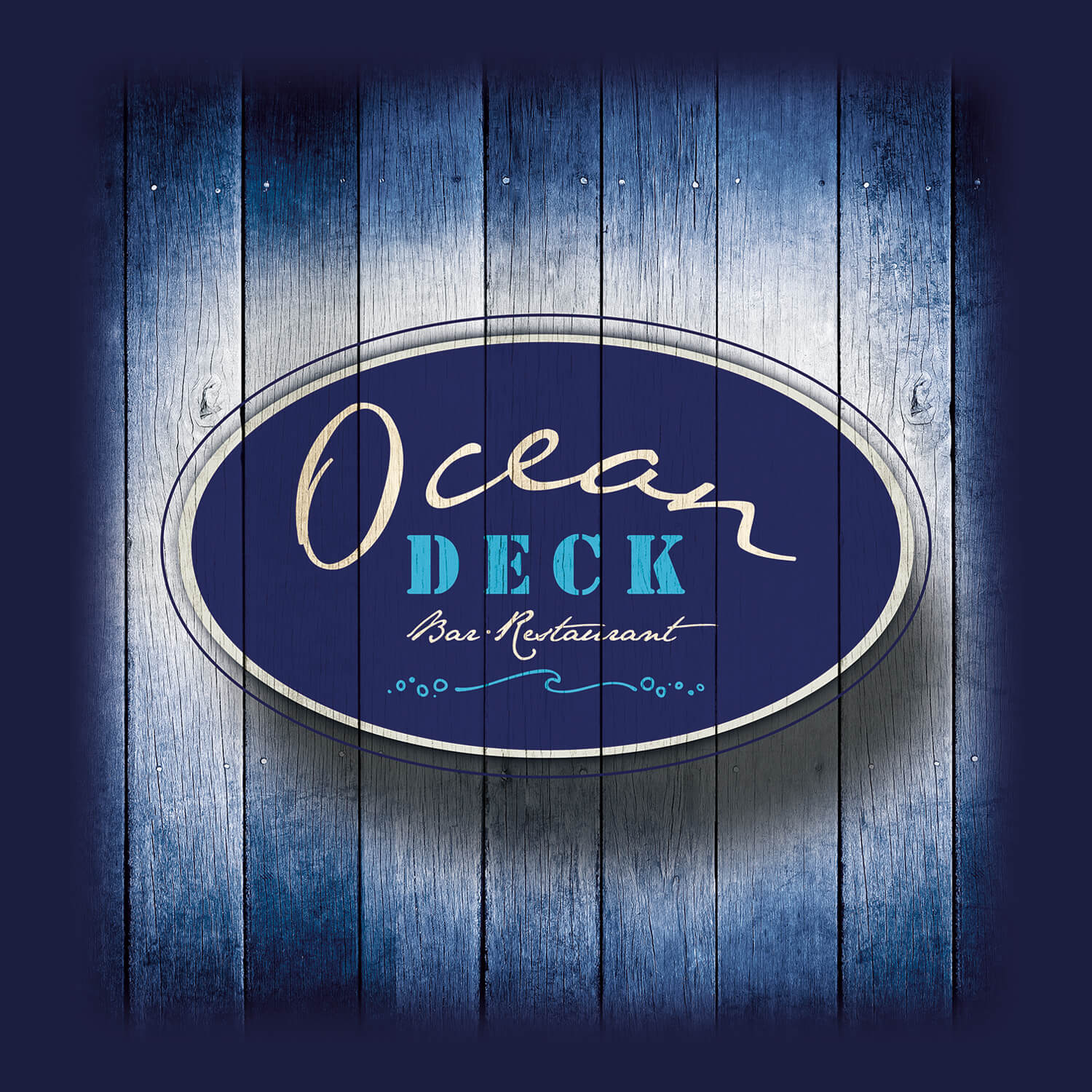
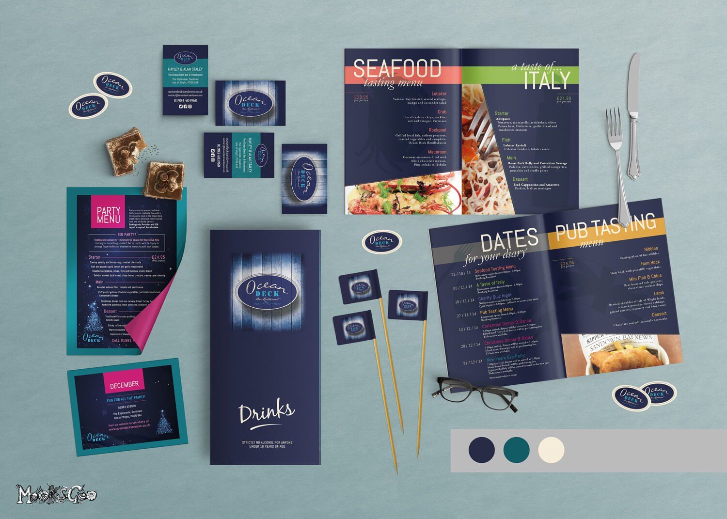
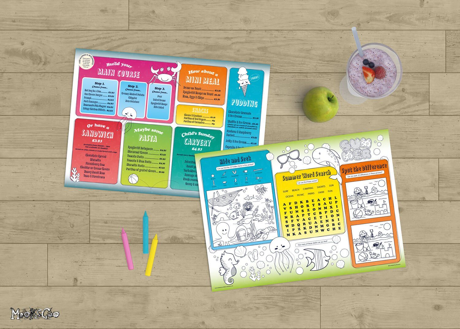
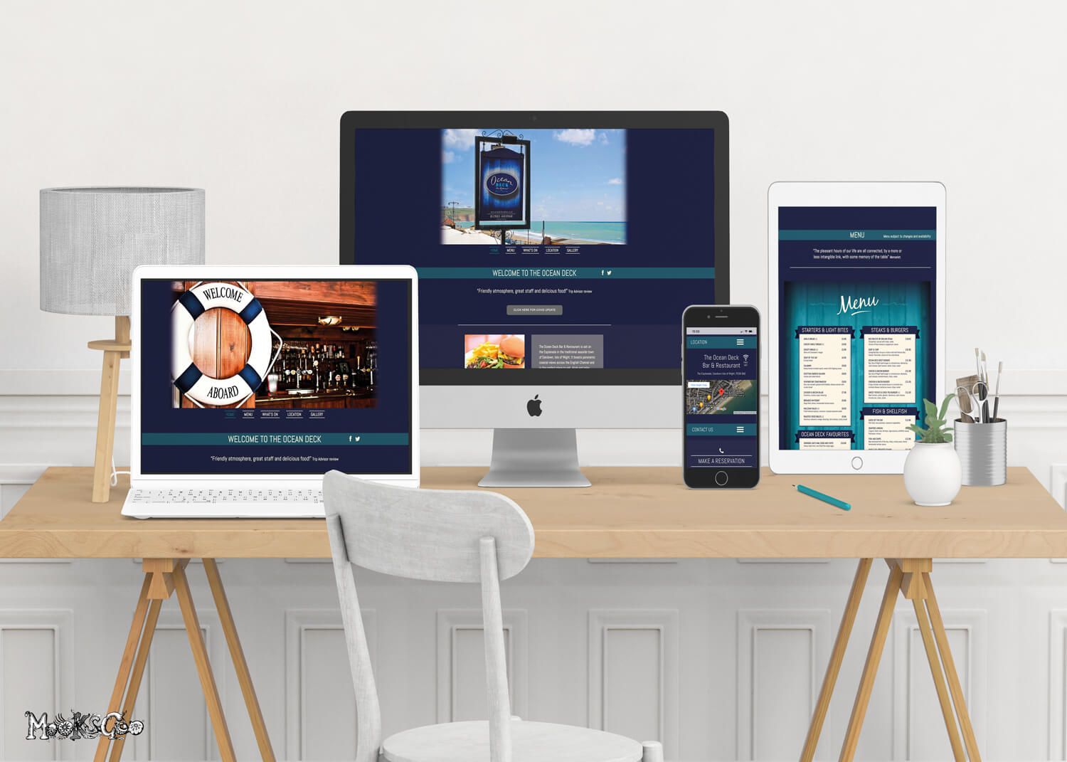
The Ocean Deck
LOGO DESIGN • BRANDING • WEBSITE DESIGN AND HOSTING • EMAIL HOSTING • BUSINESS CARDS • ADVERTS • BOOKLET OF EVENTS • COCKTAIL STICKS • A3 KIDS COLOUR IN MENU • BESPOKE GREASEPROOF PAPER • WINE LISTS • SIGNAGE • TABLE MENUS • LARGE FORMAT MENU BOARDS • LIT MENU BOX • POSTERS • PHOTOGRAPHY • ALL PRINTING •
Working with the Ocean Deck in Sandown on the Isle of Wight since 2014, this local bar and restaurant is now a thriving seaside eatery.
UPDATE 2024: New owners requested a new website - www.oceandecksandown.co.uk


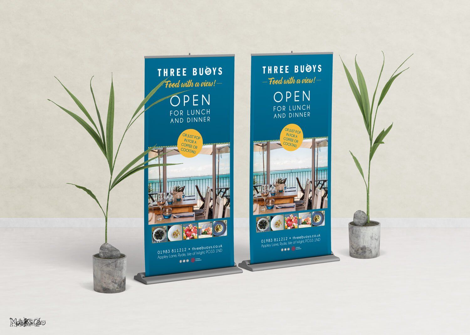
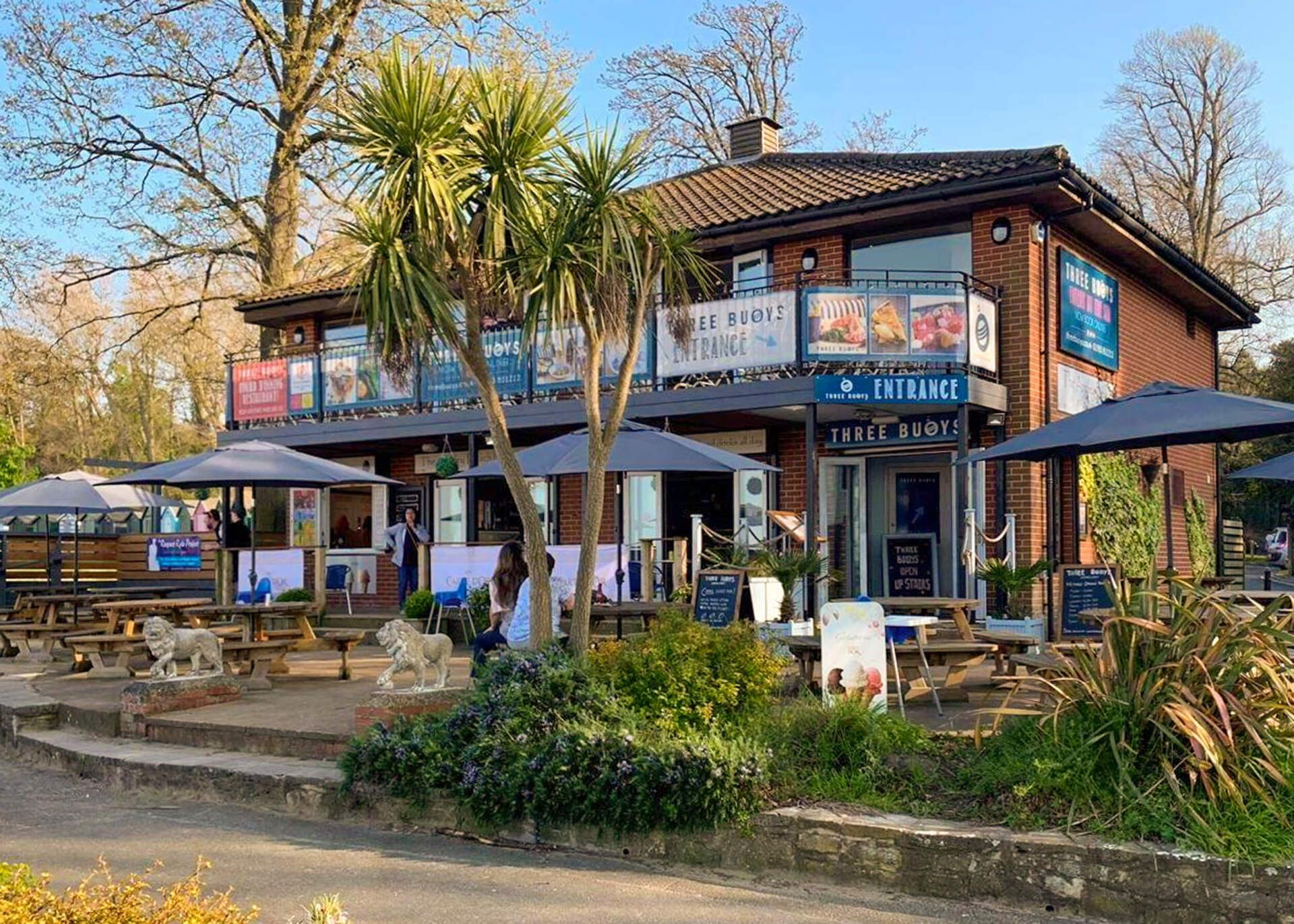
Three Buoys
Appley, Isle of Wight
LOGO DESIGN • BRANDING • LUXURY SPOT UV BUSINESS CARDS • ADVERTS • MENUS • TABLE MENUS • SIGNAGE • BANNERS • LARGE FORMAT MENU BOARDS • POSTERS • MAILCHIMP CAMPAIGN • PRINTING
Three Buoys has now sadly closed due to Covid19 in 2020, but for years prior, I helped Tim and his team create various design and print projects, from initial ideas to delivery and installation.
This restaurant was actually named 'Three Buoys' due to the owners having triplet boys! As Three Buoys is situated on the beach, the spelling 'Buoys' is a brilliant play on words. The overall logo is bold and modern, using a rich teal blue. The symbol of the 'buoy' has three stripes, representing the 'three boys'.


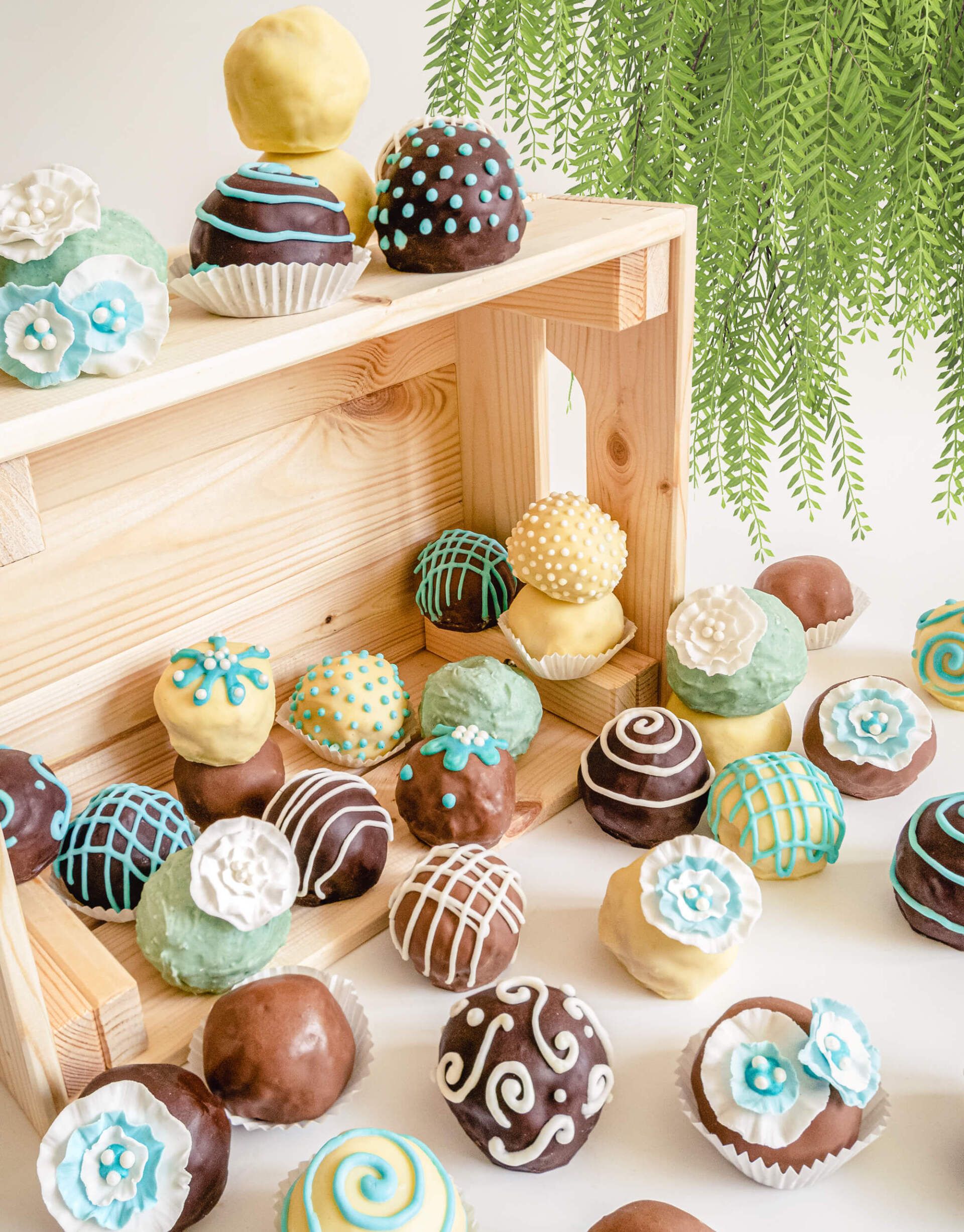
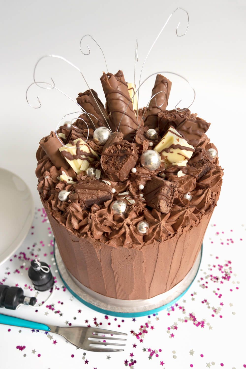
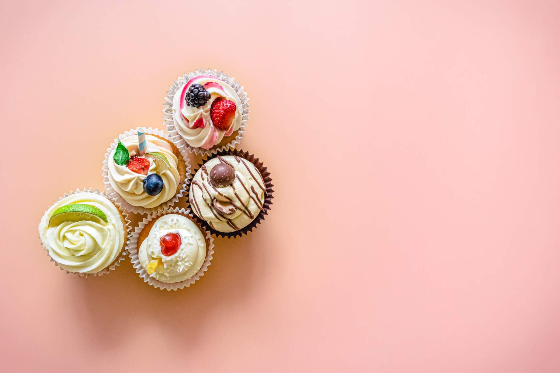
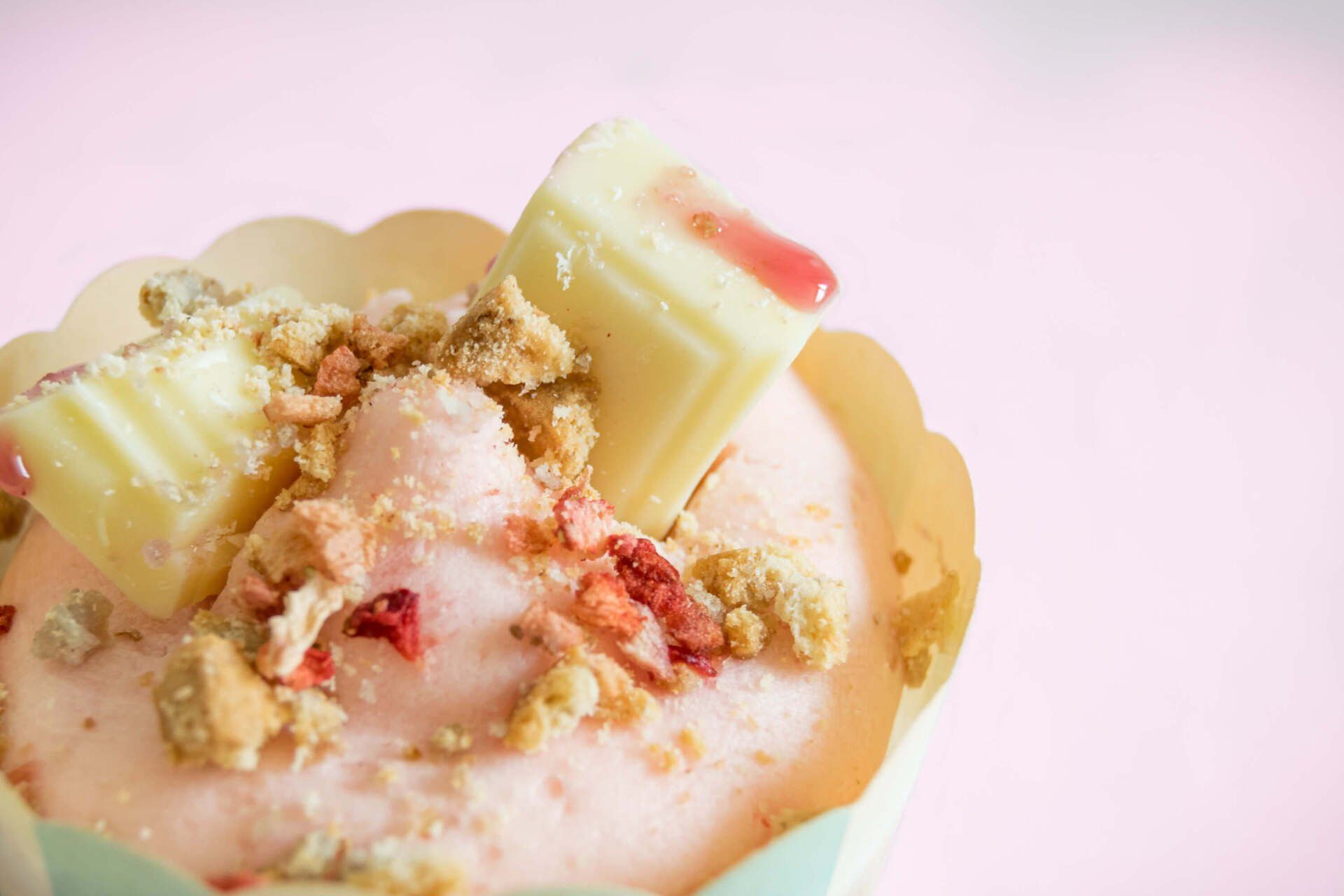
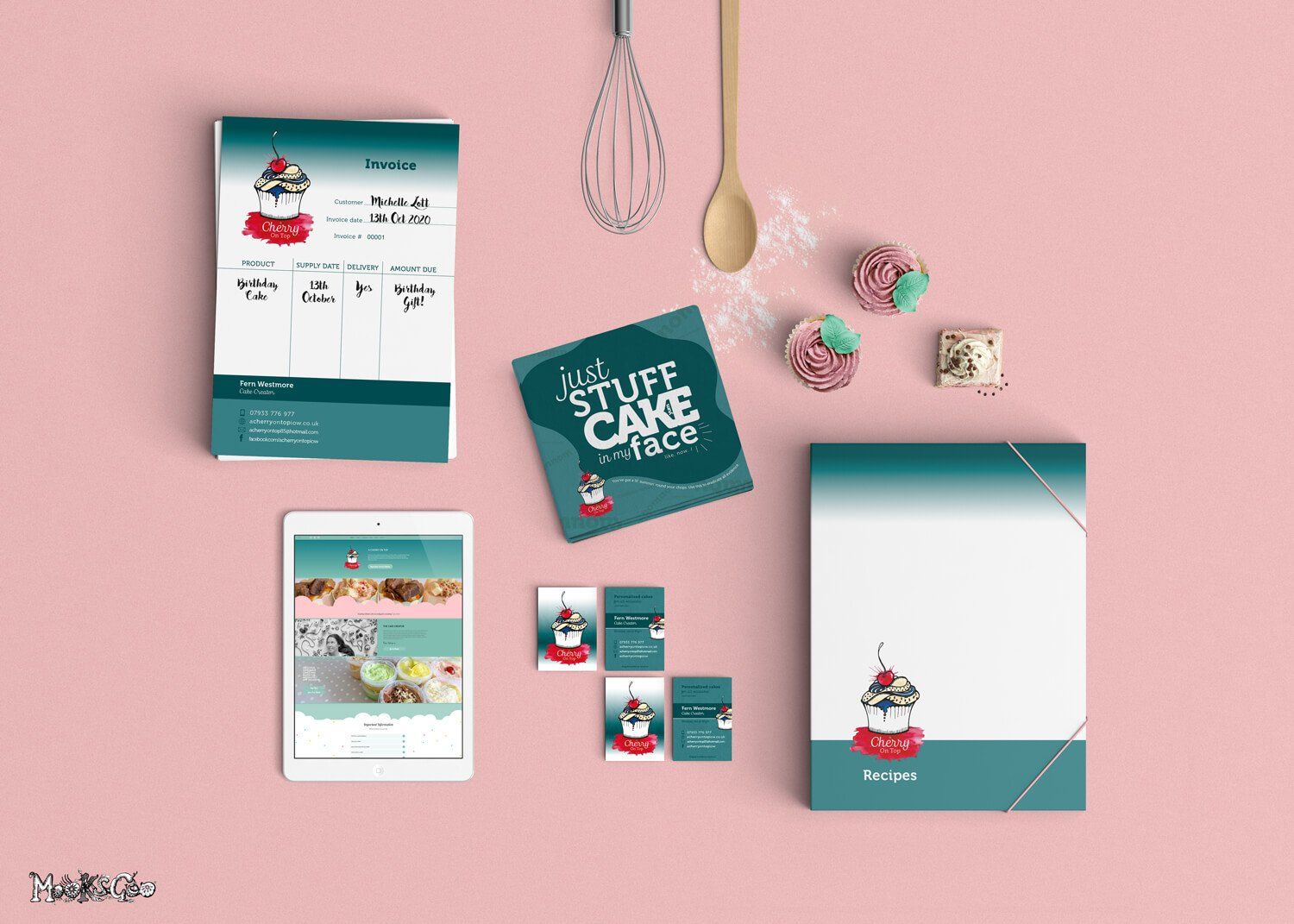
A Cherry On Top
LOGO DESIGN • BRANDING • RESPONSIVE WEBSITE AND EMAIL • PRODUCT PHOTOGRAPHY • INVOICE PADS • GLITTER BUSINESS CARDS • PRINTING
This fabulous cake creator on the Isle of Wight certainly has a talent! Fern from A Cherry On Top gave me a free brief. This meant I had complete freedom when creating her brand, which proves she knows and trusts my work.
This style is my typical illustrative statement, with hand drawn lines filled with watercolour texture. It really compliments the name and ethos of the company - hand created, raw texture and colourful - highlighting the 'cherry on top' with a splash. Fern actually lived in Spain for a period of time where she learnt a lot of her skills, so it was important to me to add an element of red (Spanish flag).
"Michelle is absolutely incredible! I'm so over the moon with my gorgeous logo, website, and all over cakey branding! My orders have increased 4 times over and I finally feel like I have a proper business.
Michelle worked so closely with me, and knew exactly what I wanted before I even did! Her passion for her work is amazing. I thoroughly recommend MooksGoo... she has literally put me on the map!"
Fern Nelson, A Cherry On Top


Leal's Tea Gardens
Godshill, Isle of Wight
LOGO DESIGN • BESPOKE SIGNAGE
A beautiful quintessential tea gardens, with gorgeous greenery and a perfectly pruned garden! The now known Leal's Tea Gardens has changed names several times in the past, but back in the 1500s it was originally owned by Louis Leal and his sister Ellen! The name Leal is a nod to its original heritage.
The style of Art Deco, Budapest and Mendl was of interest when discussing this logo design, complimented by the colours blue, mustard and gold to give a luxurious brand style.
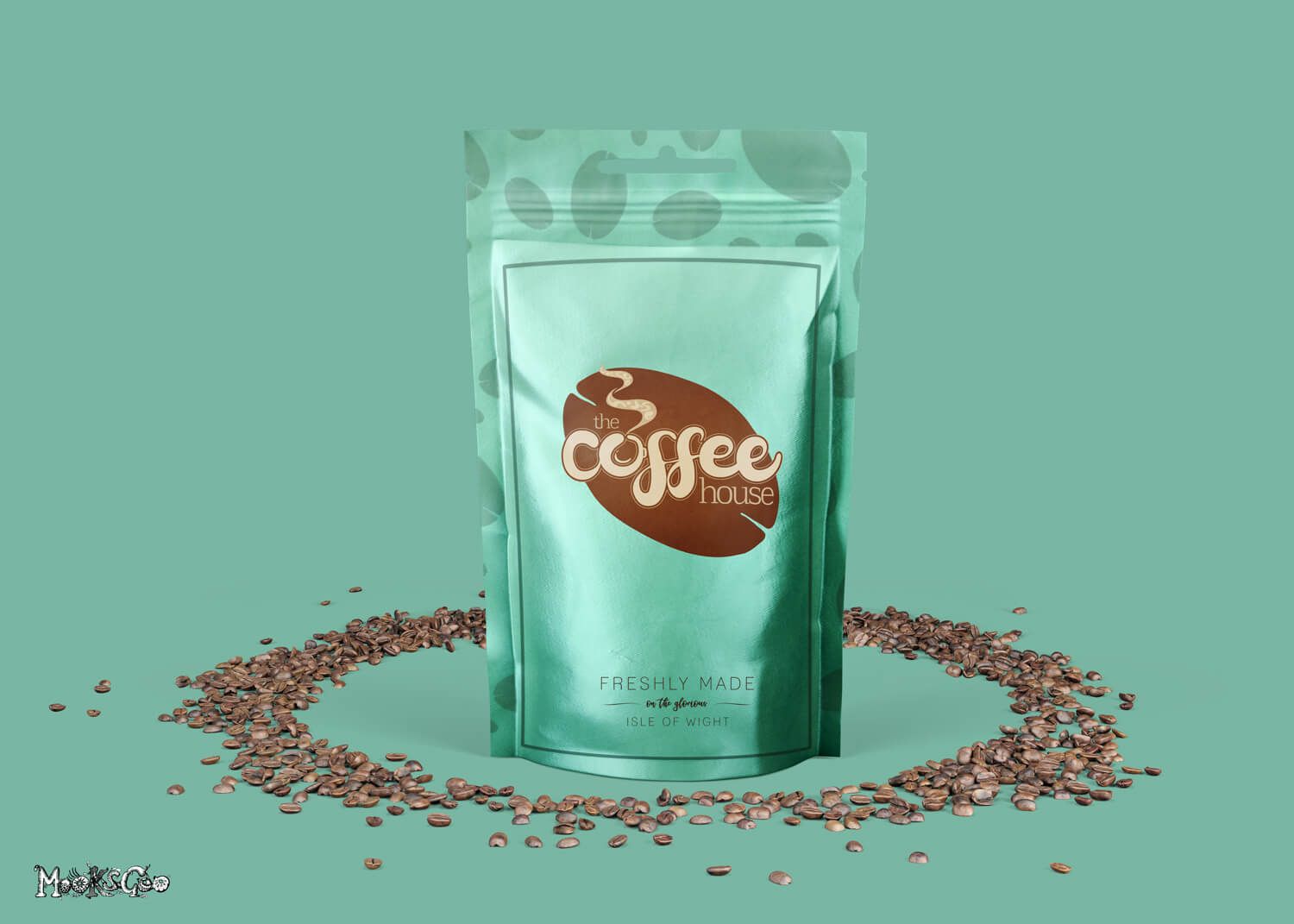
The Coffee House
Lake, Isle of Wight
LOGO DESIGN • BESPOKE SIGNAGE
These spritely customers (can you guess why!) wanted something different to the usual coffee logo - and that's what they received!
The bespoke illustrated type for 'coffee' is fun and swirly, incorporating a cup within the 'O'. The steam has the subtle words 'coffee house' to add texture. The surrounding shape is a brown coffee bean, complimented by a pastel turquoise.